
CSS interview questions test more than just your ability to change font colors. Companies need developers who know CSS inside and out.
CSS keeps evolving. Interviewers know this, which is why CSS-related questions always pop up in job interviews.
The 11 questions in this list aren’t just random interview queries — these are REAL CSS interview questions that I and other devs I know have personally faced in job interviews. They’re not just basic CSS trivia — they guide you to help identify your weak spots and level up.
What Are the Most Important CSS Interview Questions?
CSS interviews are a mix of theory and hands-on challenges. You gotta KNOW the concepts and be able to write real-world styles on the spot. Some questions test how well you understand CSS, while others push you to fix a layout, center a <div>, style a <form>, or create a responsive design in the interview.
Many interviews check if you know preprocessors (SASS), utility-first frameworks like Tailwind, and CSS-in-JS Styled Components if you’re working with React.
Are you also looking for “Typescript Interview Questions: 15 Most Recent Questions I Was Asked“?
Below are the most common CSS interview questions. Some are from my own experience, and others are from fellow devs:
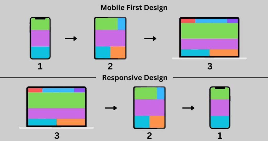
Q1: What is the difference between a mobile-first and a desktop-first approach in CSS?
A mobile-first approach starts by designing for smaller 350 — 450 px screens (phones, mostly) before adding styles for bigger screens, like laptops and desktops. Write base styles for mobile screens first and then use media queries to expand the design for larger devices.
Mobile-first loads faster on mobile devices because it uses only necessary CSS. It promotes a minimalistic design and is also better for SEO since Google checks “mobile-friendliness” first.
Desktop-first flips the concept — it starts with large screens (> 1200px) and adjusts for smaller ones. Desktop-first is better for complex layouts — like what Adobe or Facebook use — and when clients want to see the full desktop layout first. Such complex layouts have more images or interactive elements, leading to clunky mobile experiences.
The main difference between mobile-first and desktop-first is the starting point. Mobile-first begins with mobile devices, scaling up to larger screens. Desktop-first starts with the desktop layout, adjusting for smaller screens.
When answering, explain both approaches. Discuss how each method suits different scenarios in “real-world” projects. Focus on why one is better than the other depending on the project.
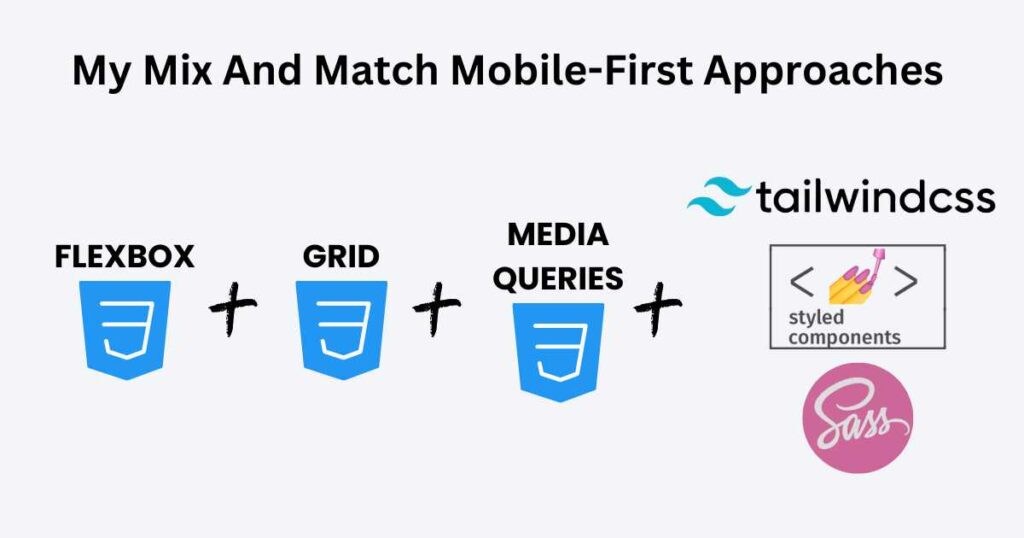
Q2: What’s your go-to method for a mobile-first approach? CSS Interview Questions
Every mobile-first approach works well if used the right way. There’s no single “best” choice — it depends on what you need. Some methods are super flexible, while others keep things structured and organized.
Depending on the project, I mix and match Flexbox, Grid, media queries, REM/EM units, and utility frameworks like Tailwind.
A project with Tailwind and Flexbox for layout covers most of my responsiveness needs right away. For pixel-perfect adjustments, I use media queries for custom breakpoints.
On a complex multi-column layout, I switch to CSS Grid. I might use Grid for the main page/component structure and keep Flexbox inside smaller components.
Typography is another key factor. (A website isn’t just about layout—it has to look good and be readable.) To scale font sizes across devices I use REM and EM units. A content-heavy websites like Airbnb do Typography well — No tiny unreadable fonts, no oversized text either!
.text-custom {
  font-size: 1.2em; /* 1.2 times the parent size */
}
REM and EM units font size that works on mobile might feel too small on desktop.
At the end of the day, no single method is enough. I lean on Flexbox and Tailwind the most. They speed up development and keep everything fluid. But when I need fine control, I’m happy to bring in the rest.
Q3: What are the key differences between responsive, adaptive, and fluid layouts?
There are three major types—responsive, adaptive, and fluid.
Responsive layouts adjust to any screen size. They use flexible grids and media queries. Picture a website that “shrinks” or “expands” based on where you’re viewing it. It provides the same UX (user experience), no matter what device you’re on.
Adaptive layouts have a few fixed versions of a site. When someone visits, the best-fit layout fills the screen. Adaptive isn’t as flexible as responsive design.
Fluid layouts use percentages instead of fixed pixels. The website stretches or shrinks based on the screen. But on big screens, stuff gets too wide, and on tiny screens, it gets squished.
If you get asked about this in an interview, talk about how responsive design is the best all-rounder. Responsive is the safest choice — it works everywhere. Adaptive is faster, but only for targeted devices. Fluid is simple but struggles with very large or small screens.
Q4: Pros and Cons of Using a CSS Framework (e.g., Bootstrap, Tailwind, Foundation) for Responsive Layouts
CSS frameworks, like Bootstrap, Tailwind, and Foundation, make building websites easier. They come with built-in styles, layouts, and grids, so you don’t have to figure out (or memorize) every CSS rule. Grab the pre-built styles and ROLL with it!!
To compare, let’s center a div using plain CSS and Tailwind CSS.
In plain CSS, you need to explicitly define the styles for the parent container in separate .css file:
.container {
  display: flex;
  justify-content: center;
  align-items: center;
  height: 100vh;
}
And the HTML:
<div class="container">
  <div class="box">Centered Box</div>
</div>
In Tailwind, you re-use utility classes directly in the HTML/JSX:
<div class="flex justify-center items-center h-screen">
  <div class="box">Centered Box</div>
</div>
The downside frameworks include styles for that you don’t use all the time. Also, customization is a pain in the neck. Plus, learning a framework isn’t always quick and easy.
If you need a website up and running fast, a framework makes total sense. If you’re working with a team and want everything to stay uniform — frameworks are helpful!! But if you want a completely unique design, writing your own CSS/SASS is the smarter move.
Q5: How does the clamp() function help with responsive typography?
The clamp() function lets you set a flexible font size that adjusts based on screen size. Instead of writing multiple media queries, you define a minimum, a preferred size, and a maximum.
clamp() takes three values:
- The first one is the minimum size — the smallest font size allowed.
- The second one is the preferred size (usually based on the width of the viewport).
- The last one is the maximum size which stops the font from growing too much.
When a screen resizes, the browser picks the best size between the min and max. clamp() automatically scales typography with the viewport, but it never makes it too small or too large.
Q6: Key Advantages Of Using SASS? CSS Interview Questions
SASS (“Syntactically Awesome Stylesheets”) is a CSS preprocessor. Instead of repeating yourself a hundred times in plain CSS, SASS lets you use variables, functions, mixins, and nesting!!
Variables
SASS lets you use variables. If you always use the same blue for buttons, you store that color in a variable — no more hunting through your code to change it.
$primary-color: #3498db;

body {
  font-family: Arial, sans-serif;
  color: $primary-color;
}
Nesting
Second, nesting lets you write styles inside styles, matching how HTML works.
// Nasting ul and li inside nav
nav {
  ul {
    margin: 0;
    padding: 0;
    list-style: none;
  }
  li { display: inline-block; }
}
Placeholders
Third, placeholders (“silent classes”) let you reuse code. Repeate styles without copying and pasting!! Placeholers won’t appear in the final CSS unless you ACTUALLY extend them.
// Placeholder
%center {
  display: flex;
  justify-content: center;
  align-items: center;
}

// Using Placeholder
.header {
  @extend %center;
}
.header adopts the %center styles. Use placeholders for grouping static styles. They keep the CSS lean by not generating code unless extended.
Mixins
Mixins let you insert styles wherever you need them. Unlike placeholders, mixins always add their styles to the final CSS, NO matter what!! They also let you pass in values — arguments.
// Mixin
@mixin text-style($size, $color) {
  font-size: $size;
  color: $color;
}

// Using Mixin
.title {
  @include text-style(20px, blue);
}
The @mixin keyword creates a reusable text-style block. The @include keyword applies the mixin inside the .title selector with (20px, blue) arguments. Use mixins for styles requiring parameters.
Partials
And finally, partials allow you to break up your styles into smaller files. They’re basically just regular SASS files but with an underscore at the beginning of the filename — _variables.scss:
// Color variables
$primary-color: red;
Now, you can import it into other SASS files:
@import "variables";

.btn-primary {
  color: $primary-color;
}
Use this method in larger projects where managing one massive CSS file becomes a headache.
Q8: What is the difference between SASS variables and CSS custom properties?
We use SASS variables and CSS custom properties (“CSS variables”) to store values in style sheets. They serve similar purposes but work in different ways.
SASS is great for maintaining consistency in big projects, while CSS custom properties allow dynamic updates (like theme changes and animations).
SASS variables exist only during preprocessing, before compiler generates CSS. SASS variables great for setting fixed design choices (colors and spacing) that won’t change. Browser doesn’t have to interpret SASS variables — they are faster because the compiler prepocess them.
$primary-color: red;
CSS custom props work directly in the browser so you can change them anytime. CSS “variables” give you more control over styling after the page loads. Use CSS custom properties when you want change styles based on conditions.
--primary-color: red;
Combine them to handle static and dynamic styling. Use SASS variables to define main values, then output them as CSS custom properties.
$primary-color: red;

:root {
  --primary-color: #{$primary-color};
}
After SCSS is compiled to CSS, you can use var(--primary-color) anywhere in your CSS to reference the color red.
body {
  background-color: var(--primary-color);
}
This will set the background color of the <body> to red.
Q9: What are the drawbacks of using SASS?
SASS has a learning curve. It’s not just “CSS but better” – it has its own syntax, rules, and structure. New devs often struggle with mixins, extends, and functions. If you don’t learn it properly, your styles turn into a confusing mess.
Another thing — SASS needs a compiler. You need a tool (Node.js, Dart SASS, or some fancy build process) to turn it into regular CSS. This extra step slows down workflow. It also adds another layer of complexity.
SASS nesting easily gets out of hand. If you go too deep, your CSS selectors will look like a “tangled web”. Deeply nested styles create overly specific selectors — harder to override!
SASS can generate bloated CSS files. Poorly written SASS leads to inefficient, bulky CSS that takes longer for the browser to process.
SASS takes time to learn, requires extra tools, creates messy code if not managed well, and might cause performance issues. When you use it, make sure you’re writing clean, optimized styles.
Q10: What is Tailwind, and how does it differ from traditional CSS?
Tailwind lets you apply styles directly to HTML using pre-made utility classes. You don’t have to write custom CSS for margins, padding, or colors. Instead, you add class names right inside your HTML elements.
/* CSS */
.button {
  padding: 16px;
  background-color: red;
  color: #f4f4f4;
}
Traditional CSS leads to bloated .css style sheets, unnecessary duplication, and naming conflicts for large projects. Though, separate style .css files follow a more structured approach.
Tailwind gives you “single-purpose” classes to style elements quickly without leaving your HTML file. With Tailwind, you build interfaces MUCH faster!! It also enforces a systematic styling, ensuring everything looks uniform.
Tailwind Config File
When you install Tailwind, it comes with a huge set of default styles — colors, spacing, typography, breakpoints— you name it!! A tailwind.config.js file lets you override, extend, or completely change Tailwind’s built-in styles to match your needs.
module.exports = {
  theme: {
    extend: {
      colors: {
        primary: '#1E40AF',  // Custom Blue is now available as `bg-primary` or `text-primary`
        secondary: '#E11D48', // Custom Red is now available as `bg-secondary` or `text-secondary`
      },
    spacing: {
        '18': '4.5rem', // 18 is now available as `p-18` or `m-18`
      },
    },
  },
}
Now, you can use bg-primary or text-secondary classes in your HTML. Tailwind’s arbitrary values ([ ]) allow custom styles without editing tailwind.config.js.
// Custom Tailwind classes
<div class="p-[4.5rem] text-[#f4f4f4]">Custom Div</div>
Hex, RGB, and HSL colors work inside bg-[ ] and text-[ ]. Pixel, rem, and percentage values work inside p-[ ] for custom spacing. It might be more readable and flexible than modifying the Tailwind config file.
Tailwind responsiveness
Tailwind has built-in responsive classes. Add breakpoints in class names instead of writing media queries in a CSS file.
Tailwind provides these default breakpoints:
sm→ 640pxmd→ 768pxlg→ 1024pxxl→ 1280px2xl→ 1536px
<p class="text-sm md:text-lg lg:text-xl xl:text-2xl 2xl:text-4xl">
  Responsive Text
</p>
Explanation:
- Default size: The
text-smclass keeps it small by default. md:text-lgit makes it bigger when the screen hits 768px or larger.- At 1024px (
lg), it grows totext-xl. - At 1280px (
xl), it gets even bigger withtext-2xl. - At 1536px (
2xl), it reaches its largest size!!
The browser automatically applies the right styles based on screen width.
Tailwind Downsides
On the downside, Tailwind can make your HTML/JSX harder to read. It clutters your elements with long class lists.
<button class="bg-blue-500 text-white px-4 py-2 rounded hover:bg-blue-700 hover:text-gray-300">
  Hover Me
</button>
Some developers find this hard to read…
If you don’t optimize it properly, your CSS file gets pretty big, slowing down your app. Use PurgeCSS (now with Tailwind) to remove all unused CSS classes, keeping only the ones that appear in your project. This can reduce file size from megabytes to just a few kilobytes!!
Q11: What Are Styled Components And Their Pros and Cons Over Other CSS Tools?
Styled Components is a CSS-in-JS library (meaning CSS is written inside JavaScript files) for React. It lets you style components directly instead of writing styles separately in CSS files.
Styled Components keep styles scoped to individual components.
Traditional CSS requires you to manage class names. Styled Components automatically generate unique class names. Instead of using class selectors, you define styles inside your component file. This makes it easier to see and change!
Unlike regular CSS, Styled Components automatically scope styles to the component. It allows you to write CSS using JS template literals. It lets you pass props to change styles dynamically.
import styled from 'styled-components';

// Styled Component for the button
const StyledButton = styled.button`
  color: white;
  border: none;
`;

const CustomButton = () => {
  return (
    <StyledButton>
      {children}
    </StyledButton>
  );
};
When you need global styles — a default font, background color, or resetting margins and padding — createGlobalStyle lets you define styles that apply everywhere in your app. Define global styles inside a JavaScript file and use them in your app’s root component.
import { ThemeProvider } from 'styled-components';
import CustomButton from './CustomButton';

const GlobalStyle = createGlobalStyle`
  body {
    background-color: ${props => props.theme.backgroundColor};
    color: ${props => props.theme.textColor};
    font-family: 'Arial', sans-serif;
  }
`;

const theme = {
  primaryColor: 'blue',
  textColor: 'white'
};

const App = () => (
  <ThemeProvider theme={theme}>
    <GlobalStyle />
    <CustomButton>Click Me</CustomButton>
  </ThemeProvider>
);
This wraps the app with a ThemeProvider, allowing components to use the theme values
Styled Components is different from CSS Modules, Tailwind, and SASS.
CSS Modules scope styles to components but still live in separate .css files. Styled Components keeps everything together inside the component file.
Tailwind can clutter your JSX, while Styled Components avoids this by letting you write styles usually.
SASS doesn’t scope styles automatically. That means you still have to prevent style conflicts manually!!
Overall, Styled Components reduce global style conflicts, keep styles organized, and allow for dynamic styling — all while staying INSIDE the component file!!
Read other “15 Real React Interview Questions I Was Asked in Recent Job Interviews“
Conclusion: Top 11 CSS Interview Questions
Before a CSS interview, you must know your theory and get your hands dirty with real projects. Flexbox, Grid, media queries, and SASS? All that stuff needs to be second nature.
I learned the hard way that you can’t just read about CSS — you have to build with it!! The more real-world CSS you write, the more those tricky interview questions make sense.
And if you feel stuck? You’re not alone! Drop a comment or share your best tips for nailing one!!
Read other “Most Recent Frontend Interview Questions With Answers“